PRODUCT
PolyAnalyst Web Reports - A cloud-based data visualization tool
PolyAnalyst™6.5 - A data mining software
ROLE
User Research, UX Design, Usability Testing, Prototyping
TIMELINE
3 Weeks
Before vs. After Overview
Drag up and down to compare designs.
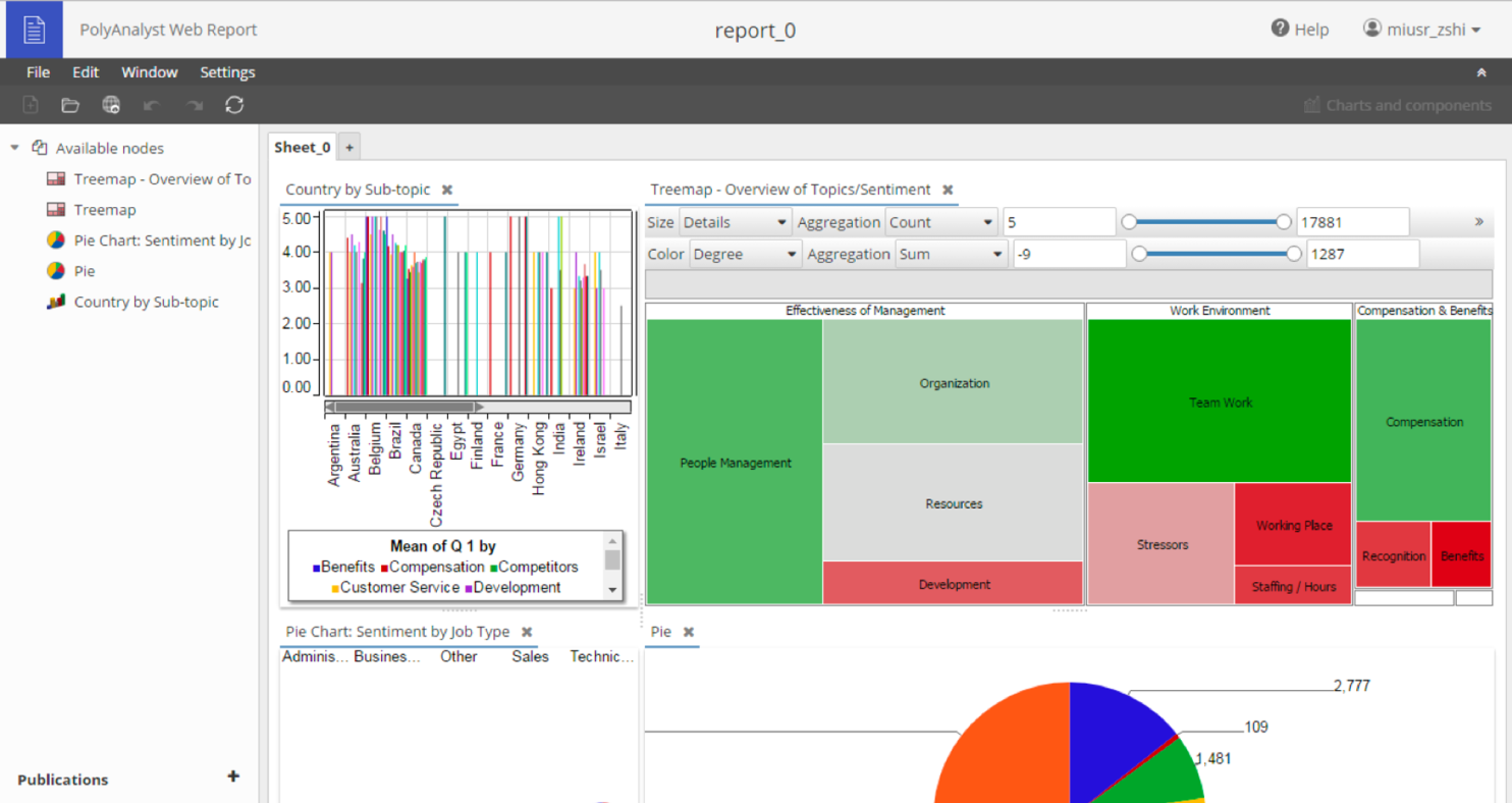
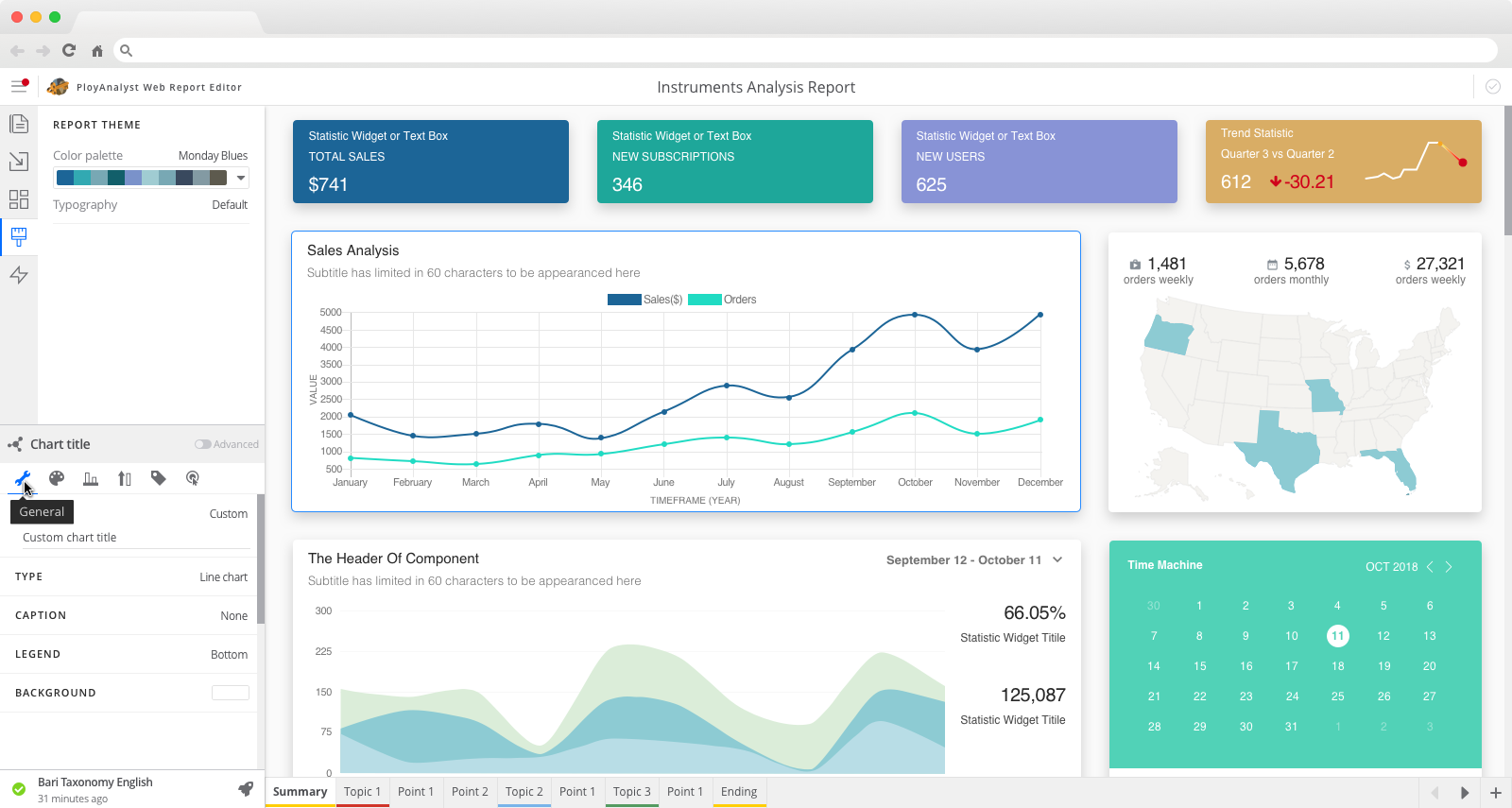
2. Appearance Settings → adjust the "look" (project focus)
What's the problem with the Apperance Settings?
• all the settings were organized in a single tree structure
• sub-level settings are in a modal window that disables the main menu
• there is no priority/no important level behind all these settings
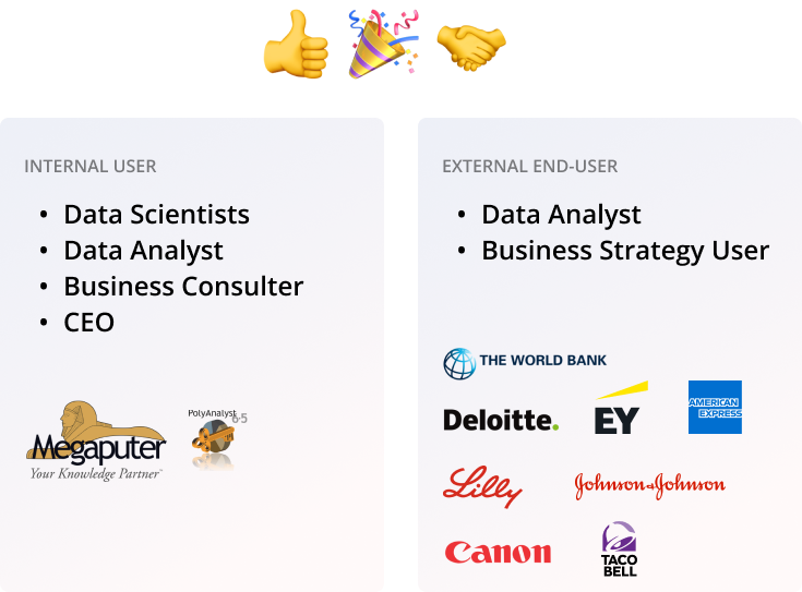
Who's the user?
Why they use "Web Report"?
• present their insights and data stories for their data mining work
• help viewers make business decisions
What they want?
• create a beautiful report easily and quickly
• spend most of the time on data accuracy and meaningful stories
Why they need to use "settings"?
• the default appearance cannot satisfy their needs
• customize the visualization component for their stories
What they DON’T want?
• don't have a good sense of aesthetic
• don't want to spend too much time on making a report
• don't want to change every single thing only if they have to
Overall Product Goal
Users can easily and quickly make a beautiful & meaningful data visualization report.
For Settings Menu
Users can easily and quickly find/use the needed appearance settings.
Where to start?
With over 50 visualization components, each with potentially unique settings, setting up a universal rule to satisfy most cases is necessary due to the system's complexity. Starting with the most frequently used visualization components would be a good place.
Data Collection
I collected the number of times each visualization component had been used in the last 6 months.
Interviews
The goal was to understand which visualization components were used most frequently and validate this with the data collected from the software.
• Analyst Team
• Linguist Team
• Customer Support Team
Concepts on reorganized the settings
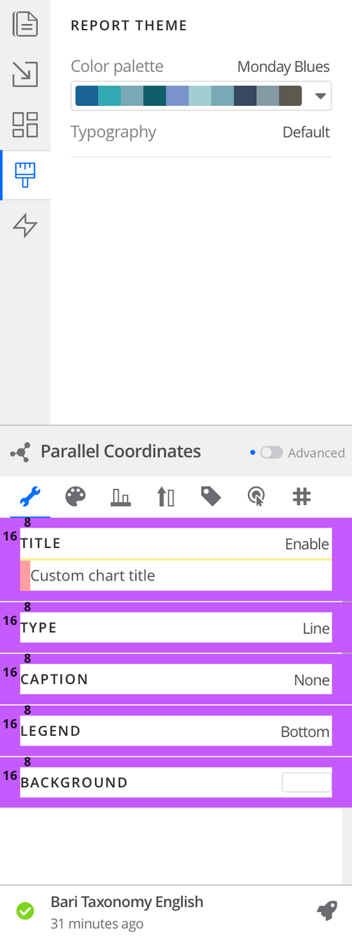
How does the interface tell rich enough information?
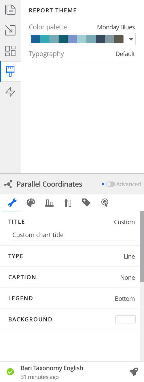
Key Status at A Glance
• regrouped settings into different tabs
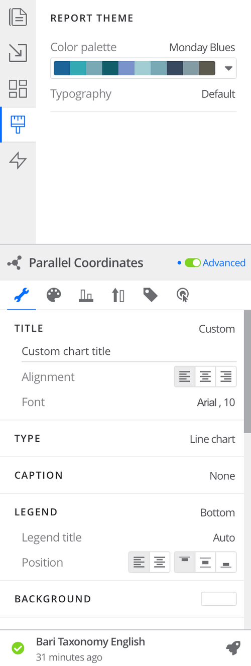
A Hint of Invisible Settings
• hide the "good-to-have", "rarely used", and "adjustment" settings in the secondary menu
Spacing
• use spacing rules to display visual hierarchy
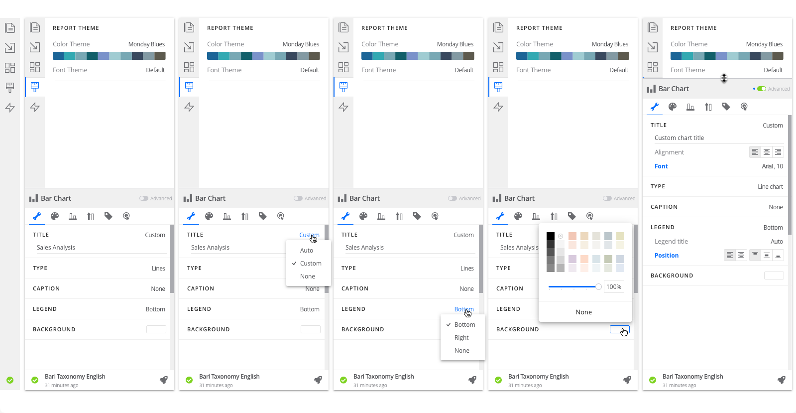
Web Report Overview
Drag up and down to compare before & after designs.


A General Setting for Each Data Visualization Component
1. Received AHA moments
I received numerous "aha" moments from both internal and external users. Our developers did an excellent job of successfully releasing the first setting menu design within 2-3 months. In 2 years, I successfully retired the old-school web-report product by implementing the new design features listed in the Appendix.
© Fuchang Phoebe Yang 2024