PRODUCT
PolyAnalyst Web Reports - A cloud-based data visualization tool
PolyAnalyst™6.5 - A data mining software
ROLE
User Research, UX Design Lead, Usability Testing, Prototyping
TIMELINE
3 Weeks
In my company, Megaputer, our internal users (data analysts & data scientists) wanted to redesign the existing navigation expereince. They hated the ugly visual style, the unintuitive interaction, and the bad reading and searching experience in the sheet list panel.
old version before I started the design
2. User Research
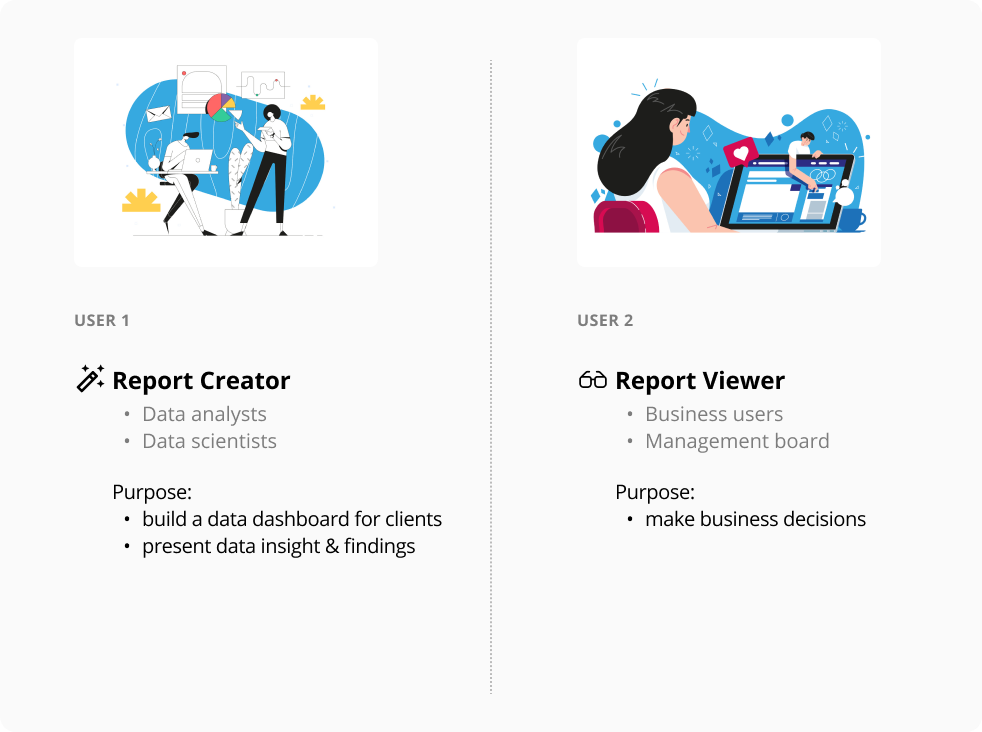
There're two target users using the product PA Web Reports:
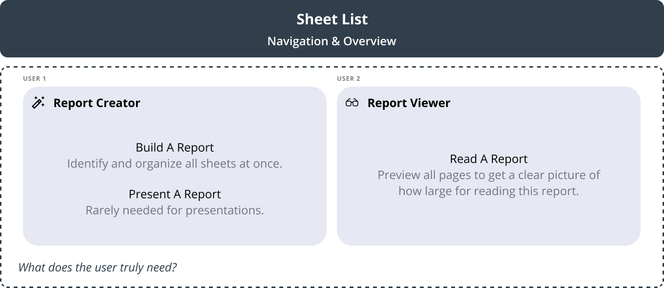
Report creators create business reports by generating meaningful text, visualizations, and data analysis scenarios. Report creators would incessantly modify and customize the specific needs of their individual decisions on each report before publishing the final business report to the client as the end user.
1. Understand Product Vision
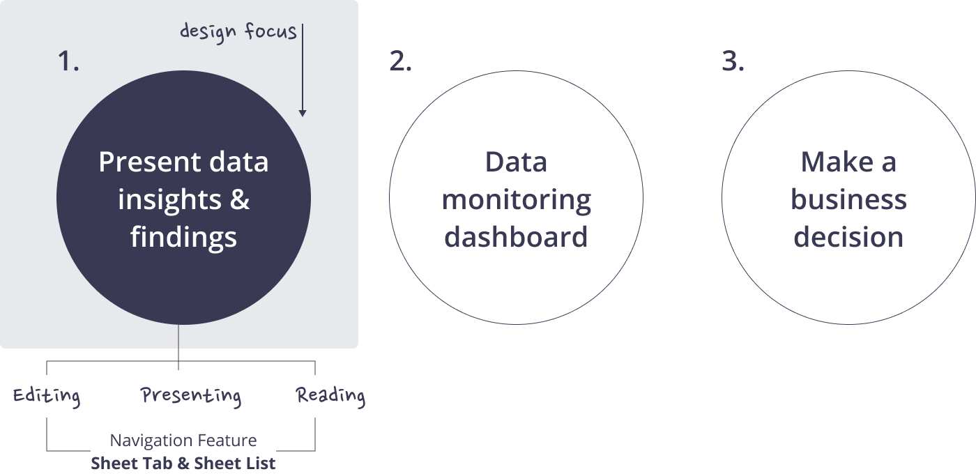
Three main purposes of using PolyAnalyst Web Report:
For the product PA Web Reports, our users are using the Web Reports for 3 main purposes. Based on the size of our existing user group and the market vision for the product that I discussed with my CEO, we decided to focus this design on helping users better present their data insights & findings.
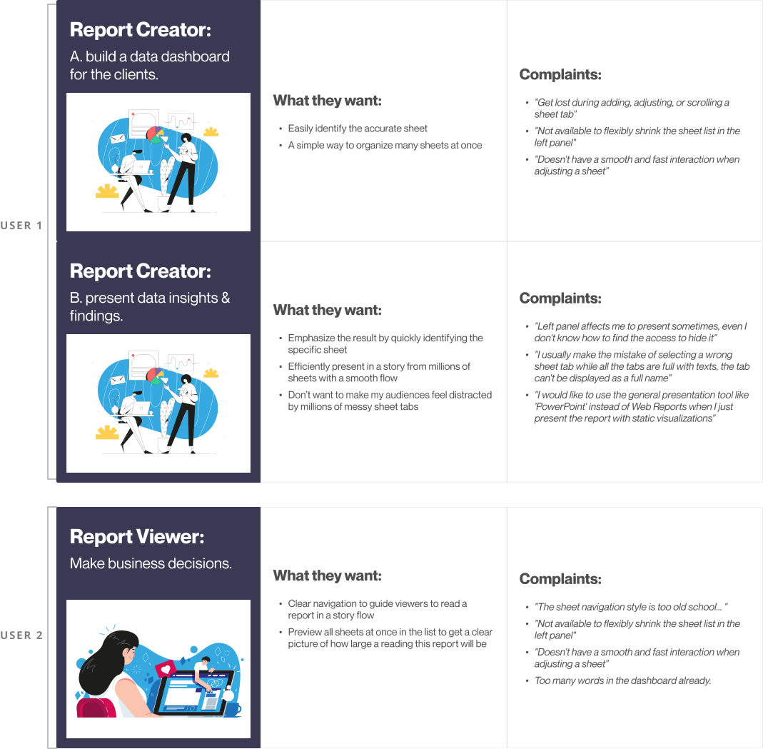
2. User Research & Shadowing
Graphic Design by Andrawan Adhitya
3. Understand Feature Vision
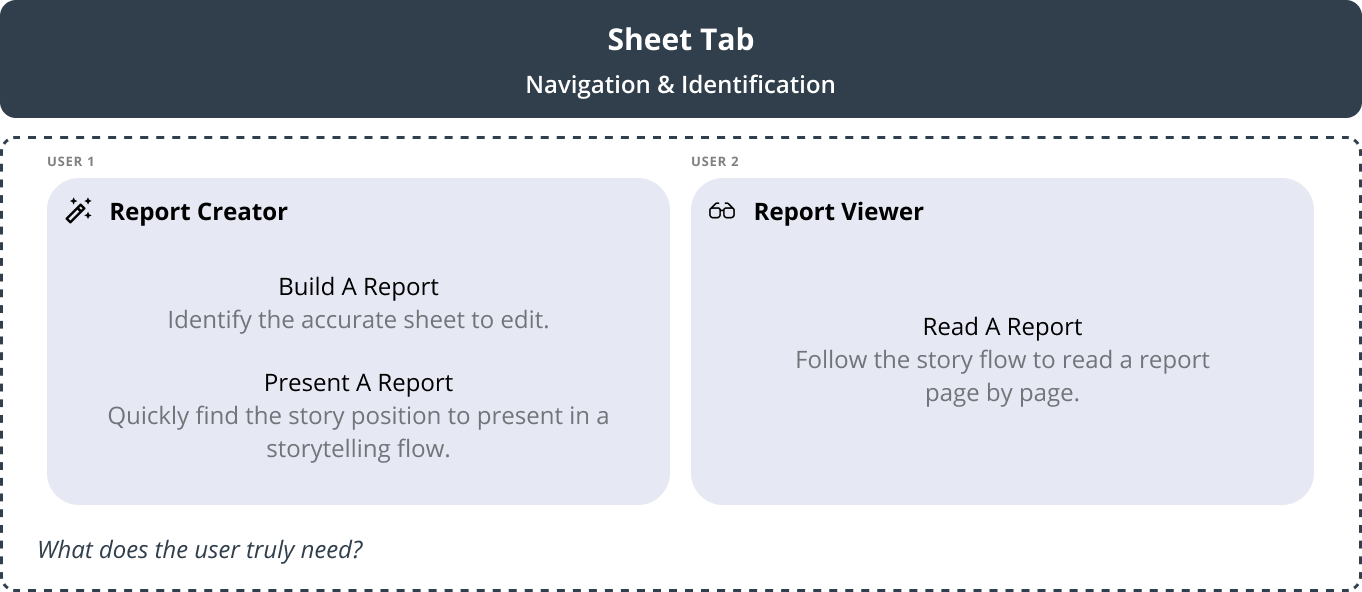
Different user has different purposes for using the feature.
a. Sheet Tabs
How to accurately identify and navigate to the specific sheet while editing?
• Clearly read the tab names
• Easily and accurately adjust the order from different sheet tabs
• Organize from millions of sheets
How to easily & accurately identify the position during presenting and reading?
• A prominent and suitable sign is better than a name for a specific sheet tab
b. Sheet List
Why is the secondary feature?
• Users just need to know the total sheets before they start finding insights into the Web Report
• It's more like an overview index in some needs at some times if users come back to check the Web Report
What should be included in the overview?
• Identify what the user wants to see in this situation
• Such as showing the "total # of sheets", "the hidden sheet", "Name", etc
4. Key Takeaways
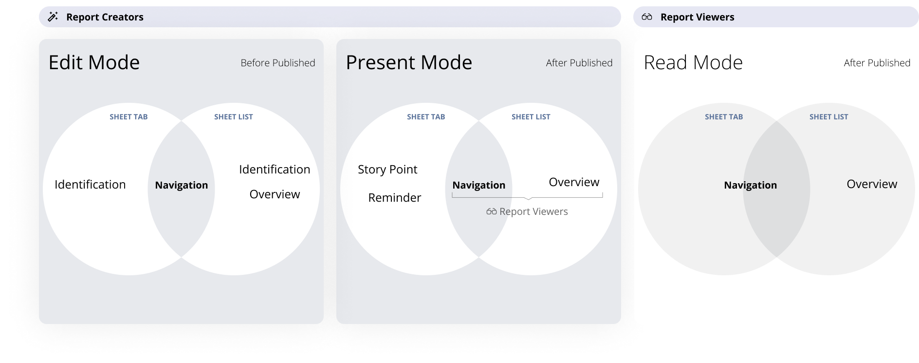
Sheet Tab & Sheet List are always playing a “Navigation” role with some additional different needs between edit mode and present mode. That I think if my design focus on these two scenarios that also can satisfy the read mode scenario.
UX: 70% of the time
Project Goal [Part 1]
Optimize the navigation feature in 2 scenarios, edit mode and present mode.
Edit Mode: Identify an accurate story page.
Present Mode: Easily find a story position when presenting a report to end-users.
UI: 30% of the time
Project Goal [Part 2]
Provide detail perfect UI to fix some existing trivial problems.
How did I optimize the design of "Navigation" & "Identification"?
a. Changed the sheet tabs position
Due to the similar text style in component headers, sheet tabs, and the top toolbar, the top part of the Web Report is visually busy. So I moved the sheet tabs from top to bottom of the screen.
Due to the similar text style in component headers, sheet tabs, and the top toolbar, the top part of the Web Report is visually busy. So I moved the sheet tabs from top to bottom of the screen.
b. Created new sheet tabs to fit the present mode
Data analysts will guide report viewers to understand a report in a story flow. So I created a new minimalist tab design with a color marker to simplify the presenting report and help data analysts find the story position by the color reminder.
I collected some examples of simple navigations tab design and started brainstorming to sketch possible ways to display simple tabs that fit a Web Report present mode.
c. Iteration
I broke down a few types of tab design by dot, line, rectangle, and square. Then I moved on to iterate the design by the steps in the following:
1. The visual design between active and inactive tab
2. Displaying the color marker on the active and inactive tabs
3. The dynamic design of mouse-hover-over a tab
I created a new way for users to flexibly shrink the sheet list in the left panel while viewing or presenting a report.
A sheet list in the left panel now can better help users get an overview of all the topics as a secondary need. The sheet list shouldn't take over the space of the report as always while users are presenting or viewing a story. So I created an option with a fluent interaction flow to allow users to decide when the sheet list is shown or hidden.
Pixel - Perfect UI Delivery
© Fuchang Phoebe Yang 2024