PRODUCT
ServiceChannel Facility Management - Work Order Function
ROLE
Mobile Enterprise Design Lead, UX Design Lead, Usability Testing, Prototyping
TIMELINE
2.5 Weeks
Walmart wanted to move {Related asset info} to the WO page.
Walmart wanted to move {Related asset info} to the WO page.
How did I evaluate this project requirement?
My project manager's idea was to provide relevant asset information on the front page so that it would meet the client's needs.
Is this the best solution?
Functional (real-world case)
- Multiple assets linked to a WO
UI
- Messy hierarchy of information
- Not enough space
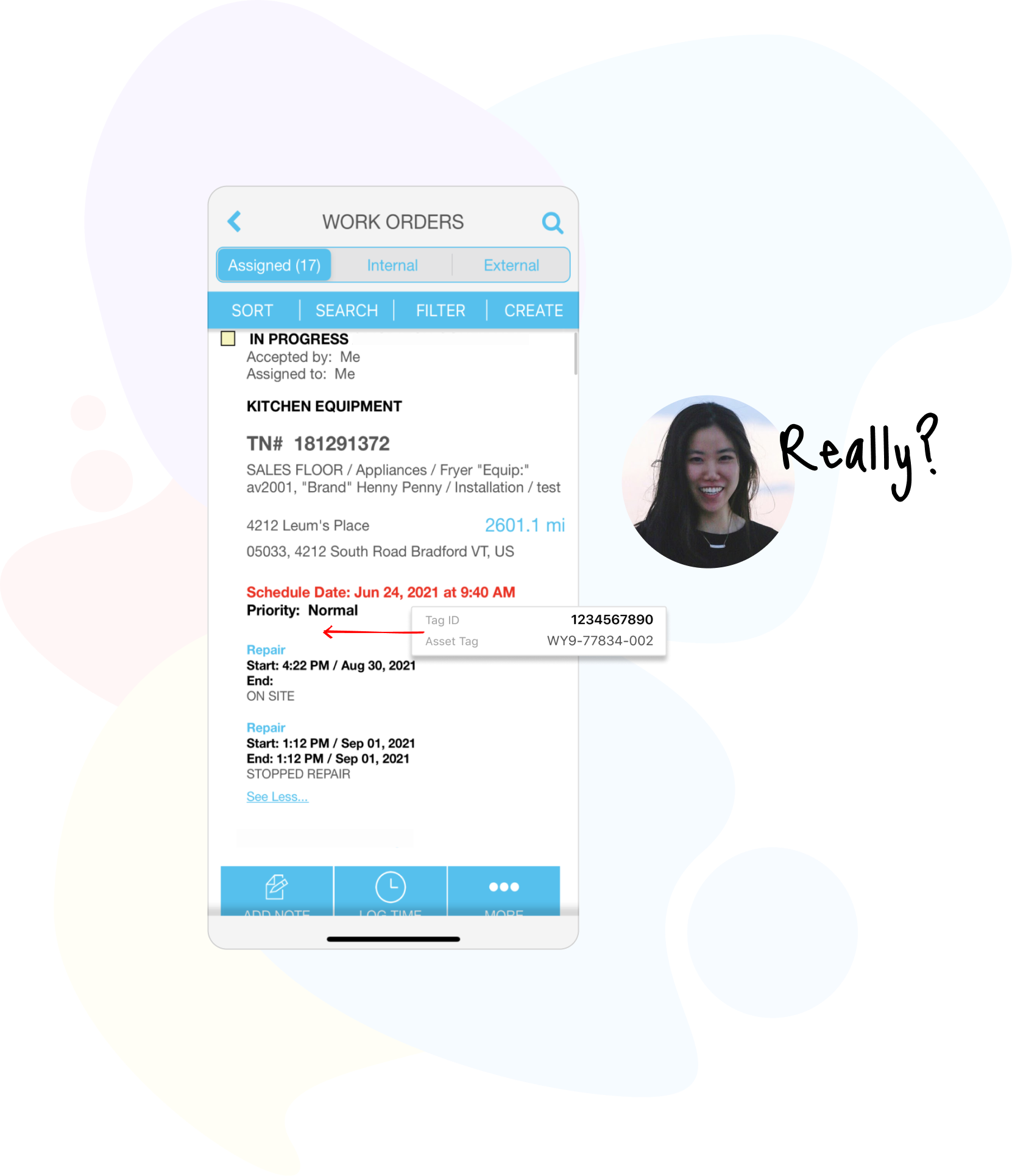
1. Does the messy WO list UI acceptable?
Know my design constraints.
I began facilitating a conversation with my project manager, design team manager, and product VP to understand their insights and feedback on the existing and future product vision.
I brought my research below to share and guide the conversation to verify whether continuing to add information to the existing messy interface was the best solution that helped me better understand the design constraints and scope of the project.
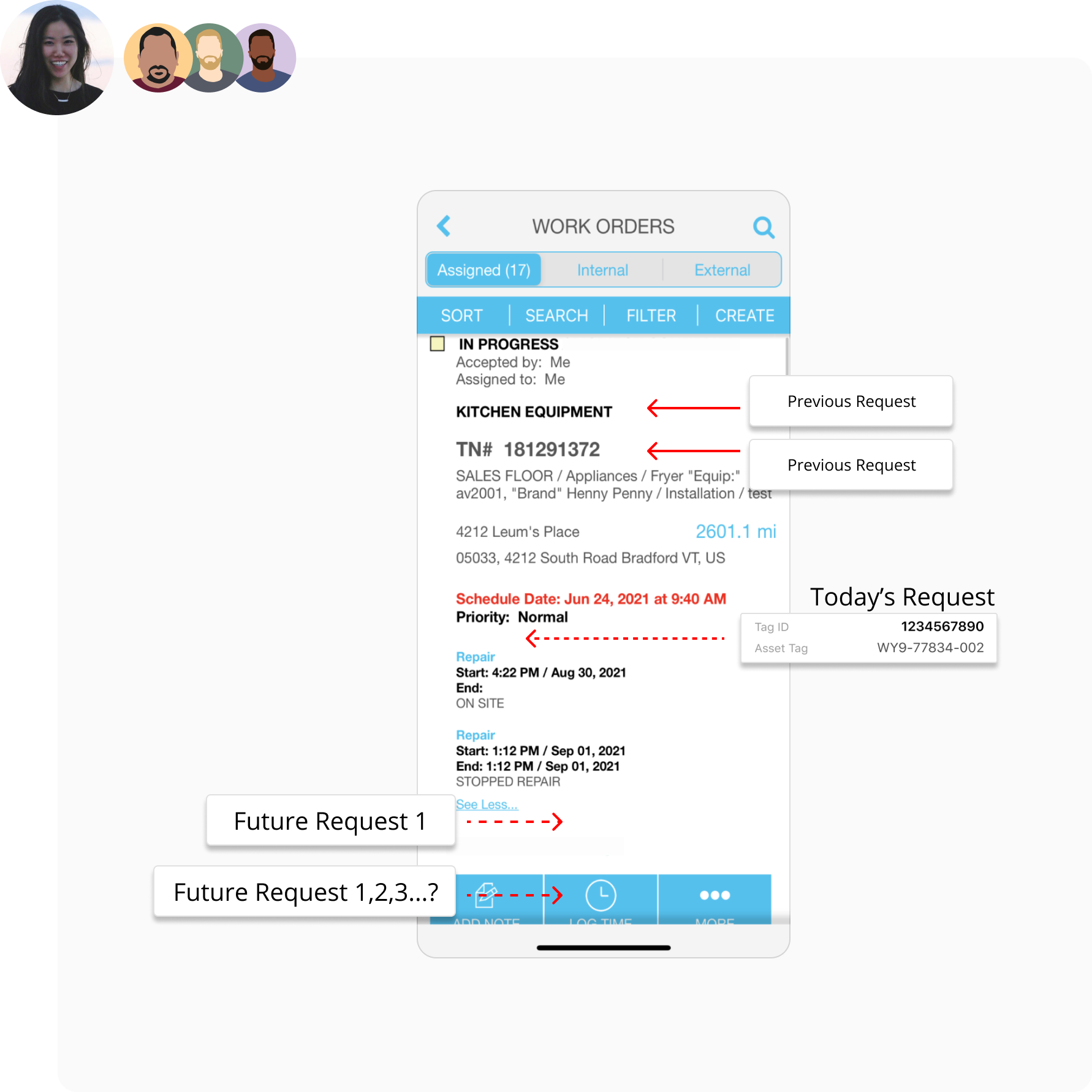
a. I combined past, present, and future observations and requirements for new information entered into 2B by different customers, the future interface will only continue to be cluttered and overloaded with information.
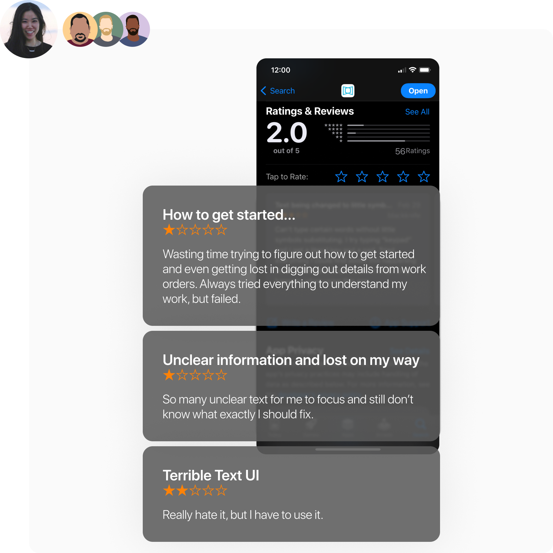
b. I did research by searching and reading our app review. There were so many bad reviews that users complained a lot about how to get started using the WO feature, and couldn't understand the key information from the existing text UI.
2. Where does this request come from?
Who? Which type of client?
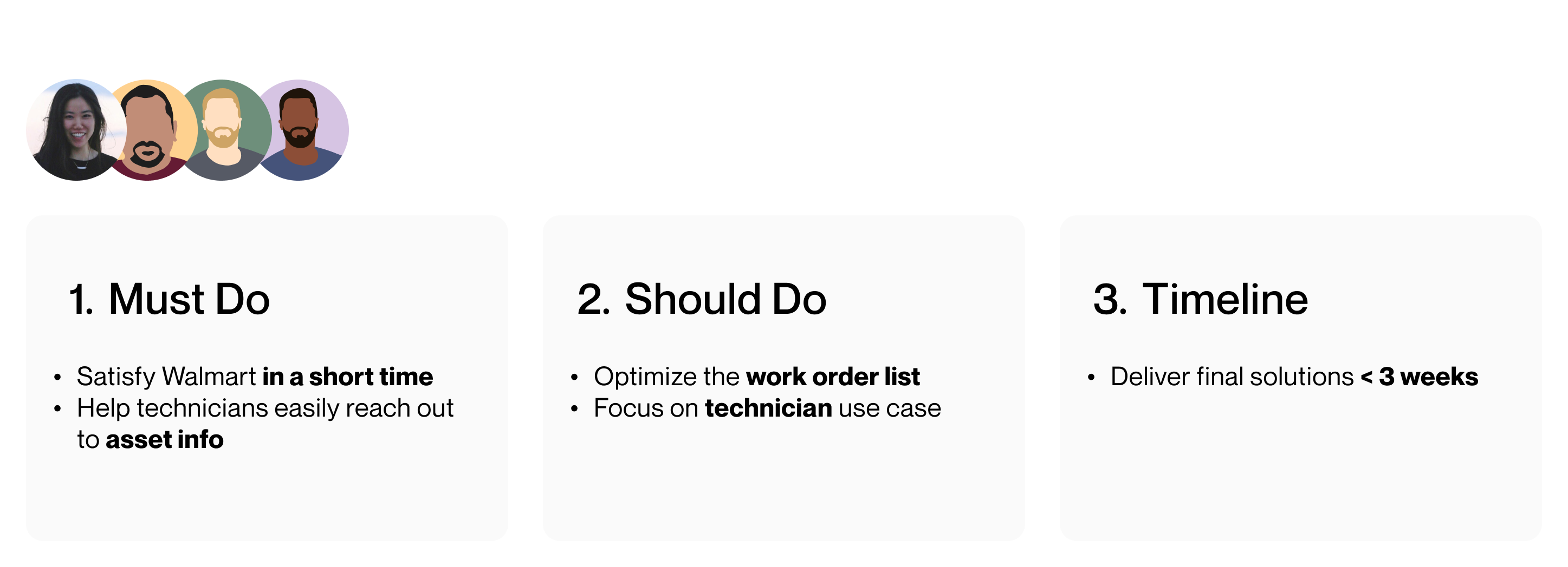
I learned from my leadership and product manager to better understand this project's mission and what I had to do. The ultimate goal was to satisfy Walmart and help ServiceChannel retain the contract with Walmart this year.
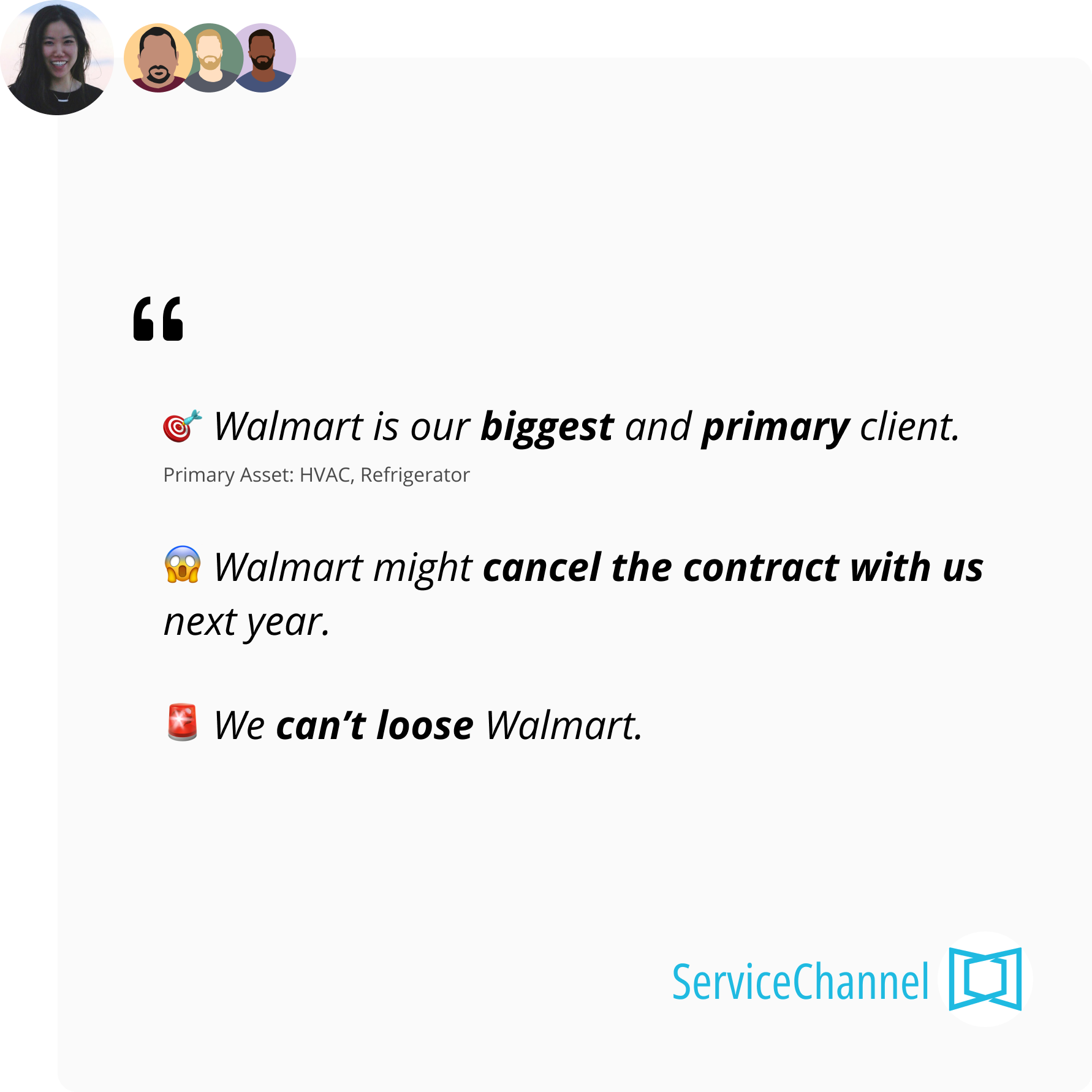
3. Why do they need this information?
For whom? What problem they want to solve?
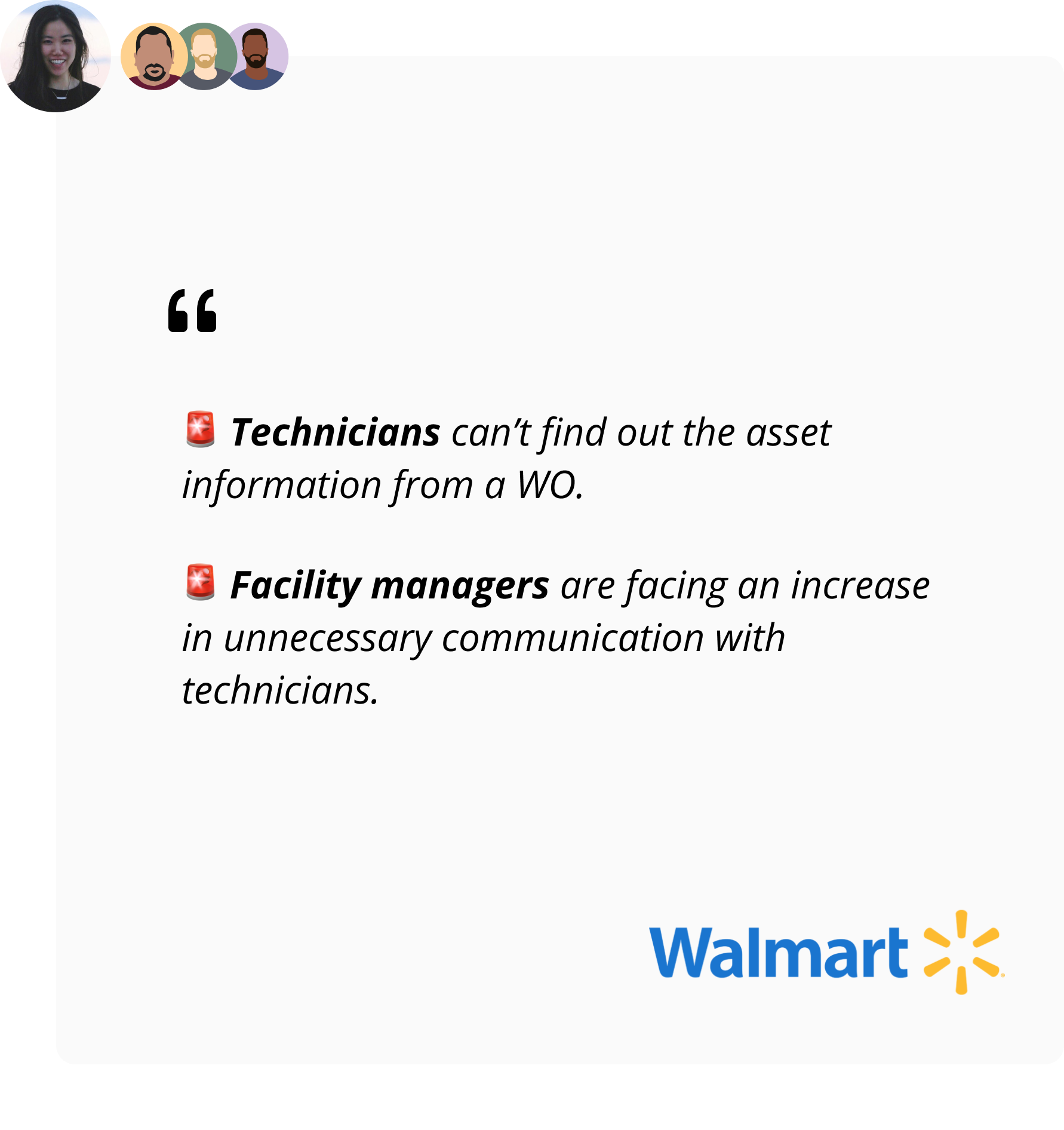
I learned from my leadership and product manager to better understand Walmart's main pain points came from their internal collaboration between Technicians and Facility Managers.
To quickly solve the problems above, I started by identifying the user workflow below and analyzing the related information reflected.
I used the RITE design methodology to quickly create multiple wireframe ideas and prototypes based on my initial analysis of the user's workflow and key information assumptions and began with online usability testing with Walmart's technical staff.
The main goal of this process was to verify with technician users about the must-have key information on the Work Order page to help them understand on-site work.
I used the MoSCoW Prioritization method to efficiently help me communicate with users and find out the WO information aligned with "Must Have", "Should Have", Could Have", and "Will not Have". I also found out that there’s a rule behind a description format which is a problem statement.
Pain Point 2
Analyze Button Usage Interactions
I reached out to our internal customer success team to grab some data that helped me quickly understand and verify the Work Order button usage.
How many clicks have users made on buttons during the 30 days?
In 3 parts, before log time, logging time, and after stopping the time, I want to understand how many clicks our users have made on each of these buttons during the 30 days, and then I can look at the following data to gain insight.
Final Design Solutions in A Work Order Container
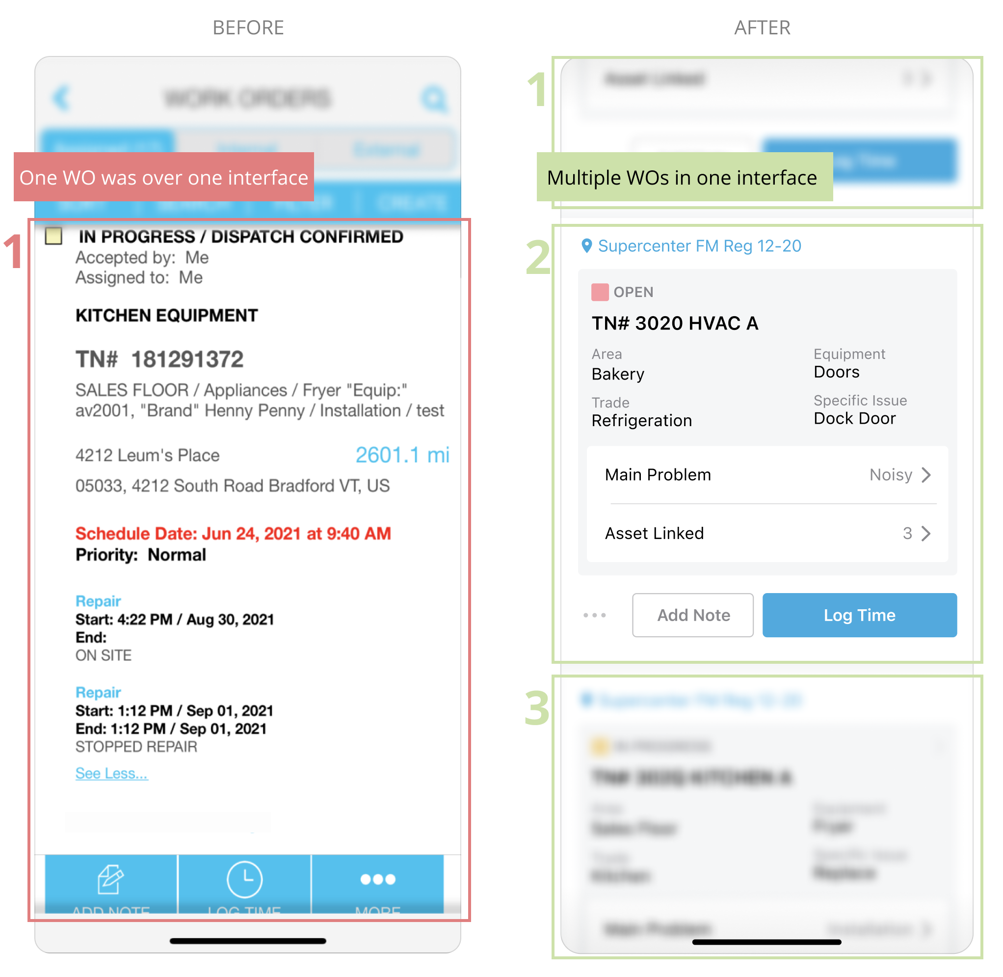
Button Design Improvement
During usability testing, I realized that the primary buttons should be "Record Time" and "Stop", and in the technicians' work process, they would sometimes use the "Add Note" button to leave some notes for the facility manager to track or manage the next time. I hid the other buttons because the techs didn't really care, and I also rearranged the button hierarchy.
Work Order (WO) Information Readesign
During usability testing, I realized that the main basis for technicians to understand a work order was the "type of work order" (with the area, equipment, trade, and specific issue), "main problem" and "asset" related information. As a result, I designed a scalable layout of WO information, as well as created a bottom sheet interaction to support a quick view of the main issue and asset details in the WO.
Holistic Approach
Pain Point 3

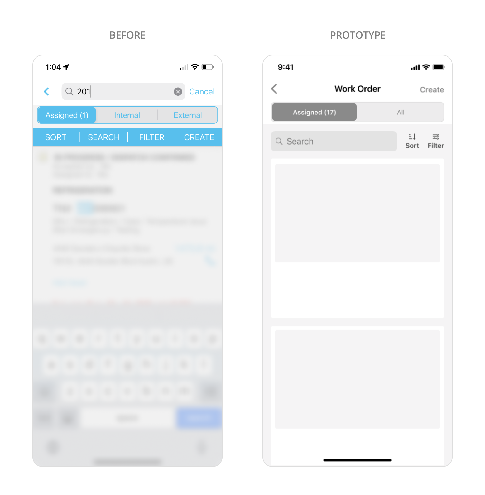
Awkward Segment Control & Tab Features
• Same visual style different purposes
a. Finding: sort/filter/search
b. Creating task: Create
• Two duplicated [Search]
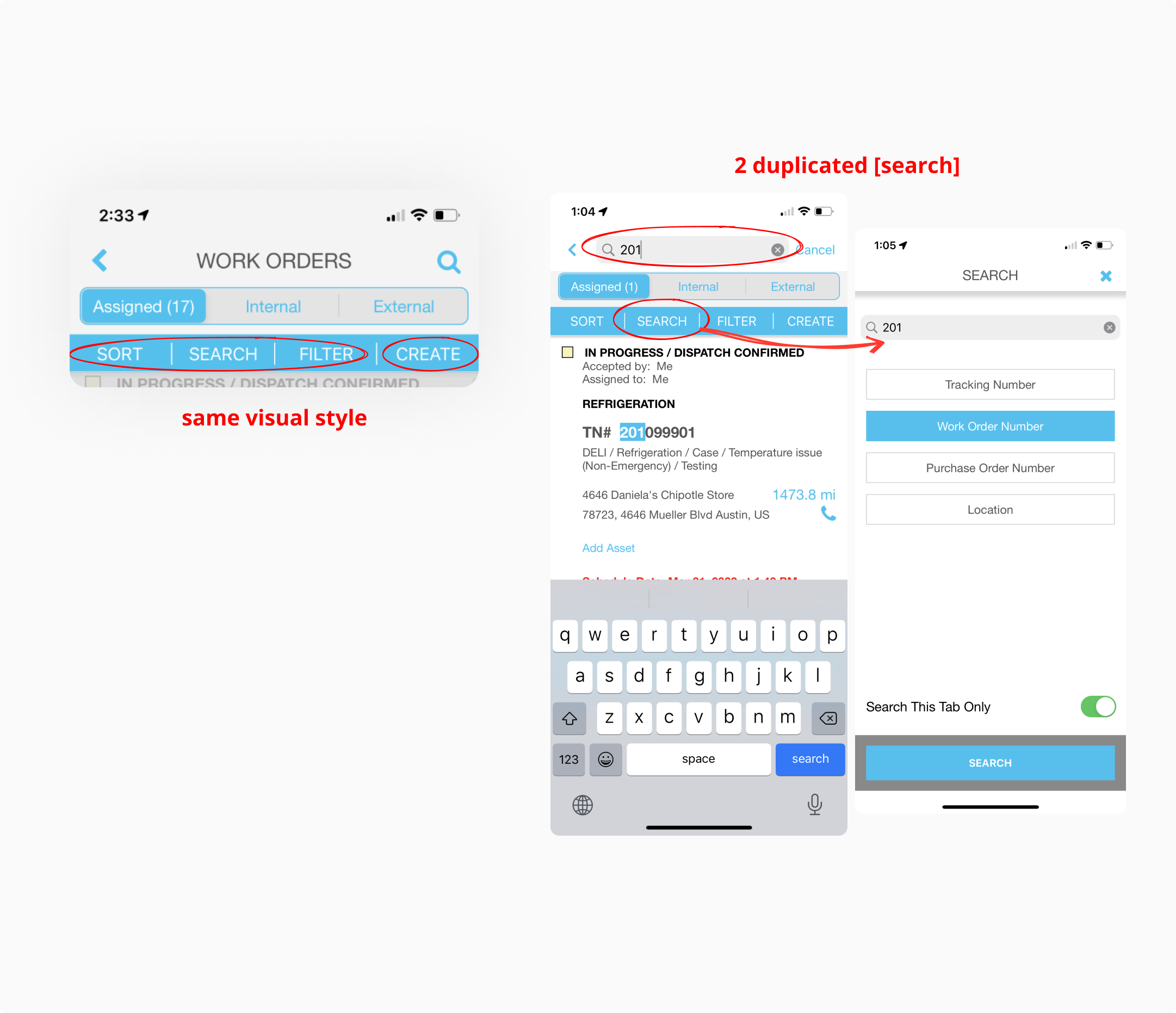
Insight Finding
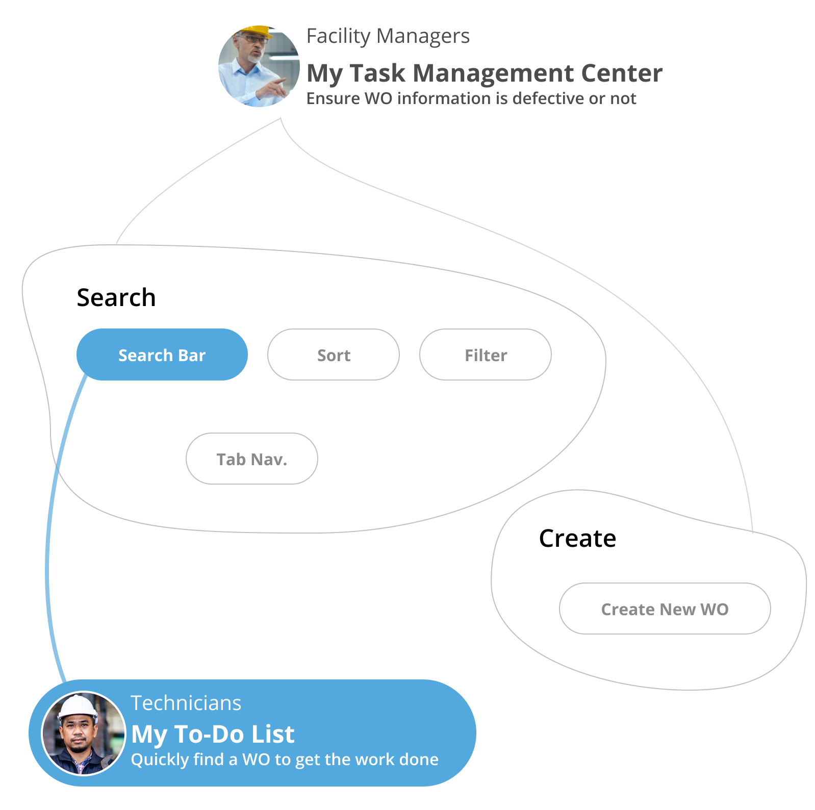
For the top app bar with "Search" and "Create" features, I realized different users had different purposes for using the work order feature.
© Fuchang Phoebe Yang 2024